WEBSITE
Canberra University
The agency OMG Creative developed a print-based look and feel for the new Canberra University website, as well as a basic site structure. My role was to transform the ATL creative into a responsive user-centered website which would act as an access point for current and prospective staff and students. Design considerations included accessibility, frequent content updates which could potentially alter the structure of pages, as well as a complex site architecture. We needed to ensure fast display times in any location, without losing the look and feel of the original print-based creative.
View site design       Visit live website
HOMEPAGE
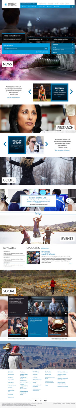
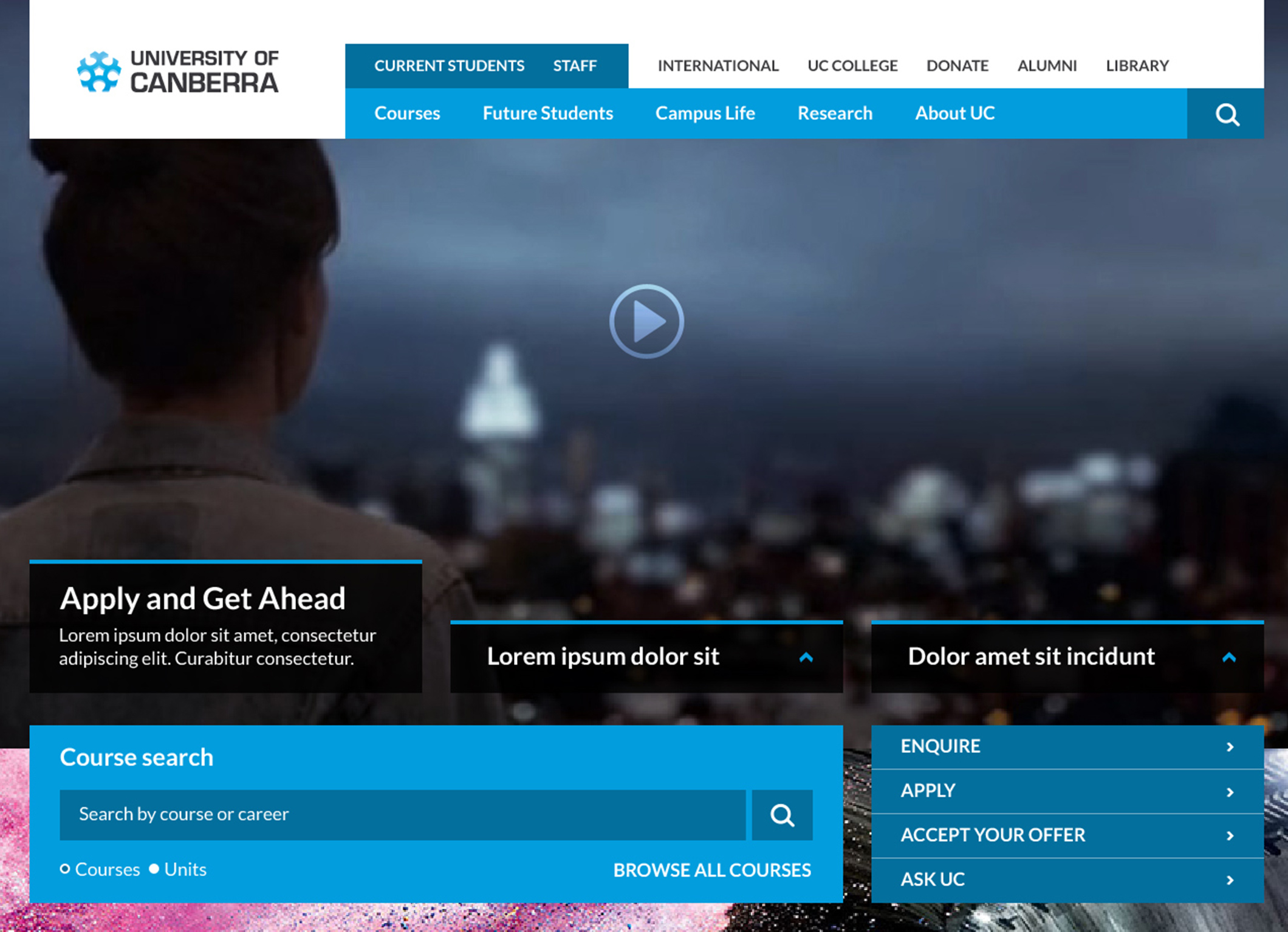
UI
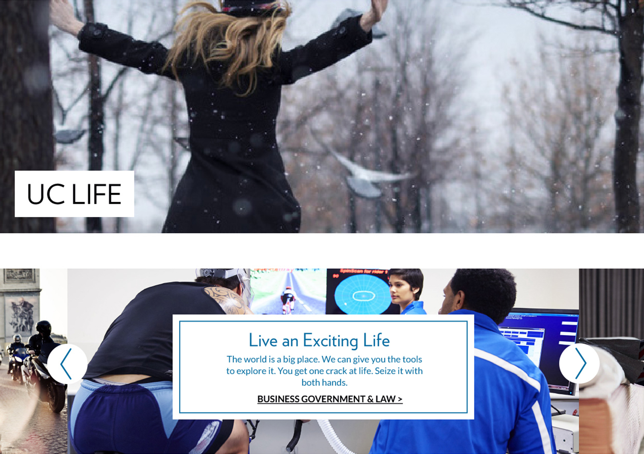
Hero content
The hero section allows the university to post up-to-date content and promotions throughout the year, allowing them to use this space for large scale images as well as video. The multi-tier navigation in this section provides users with quick access to every relevant section of the website.
UI
Flexible structure
The homepage design had to be flexible to accommodate regular content updates. I worked with the developers to ensure that building blocks such as news sliders and section heroes could be easily replicated or removed from the page.
UI
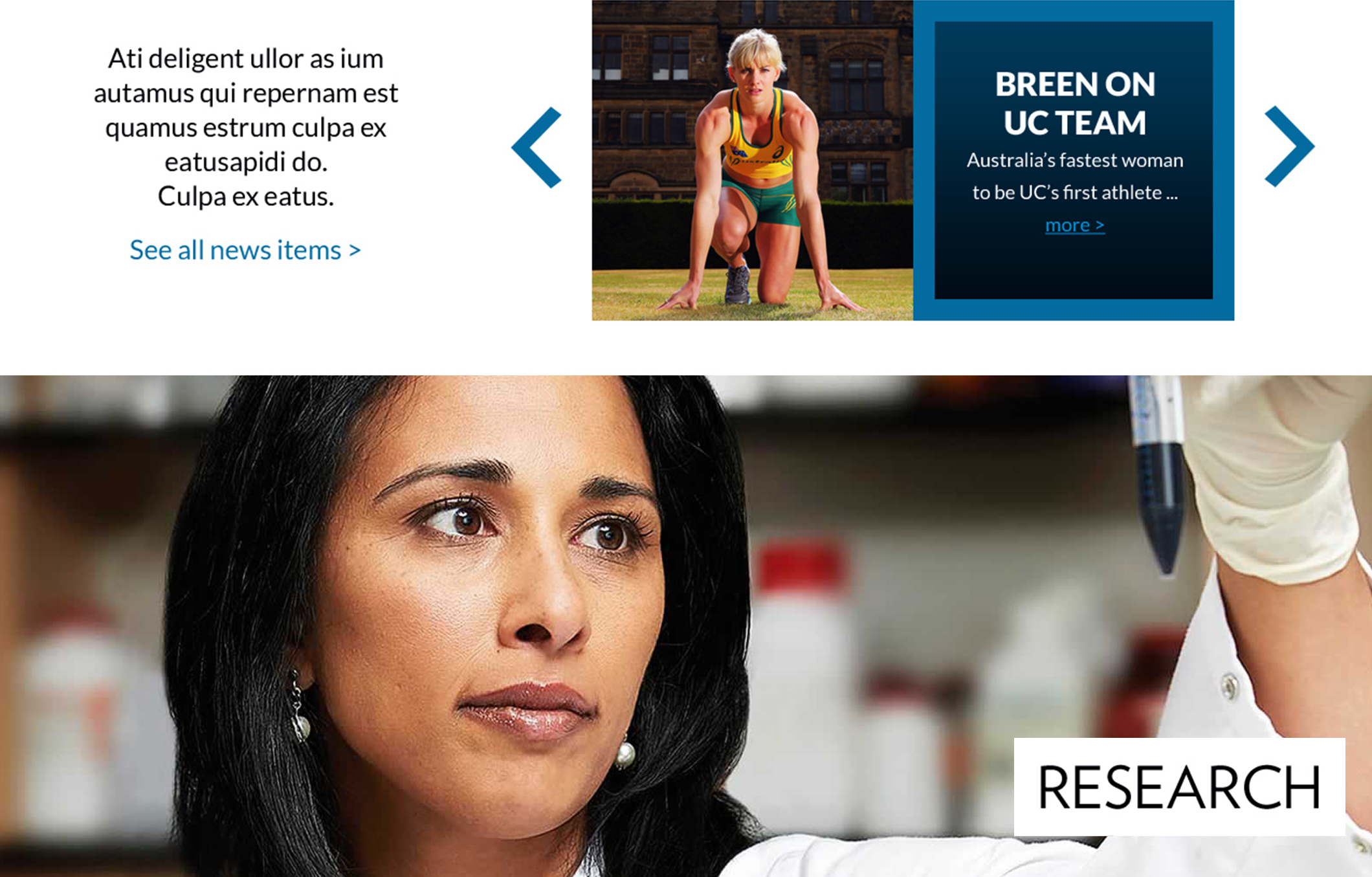
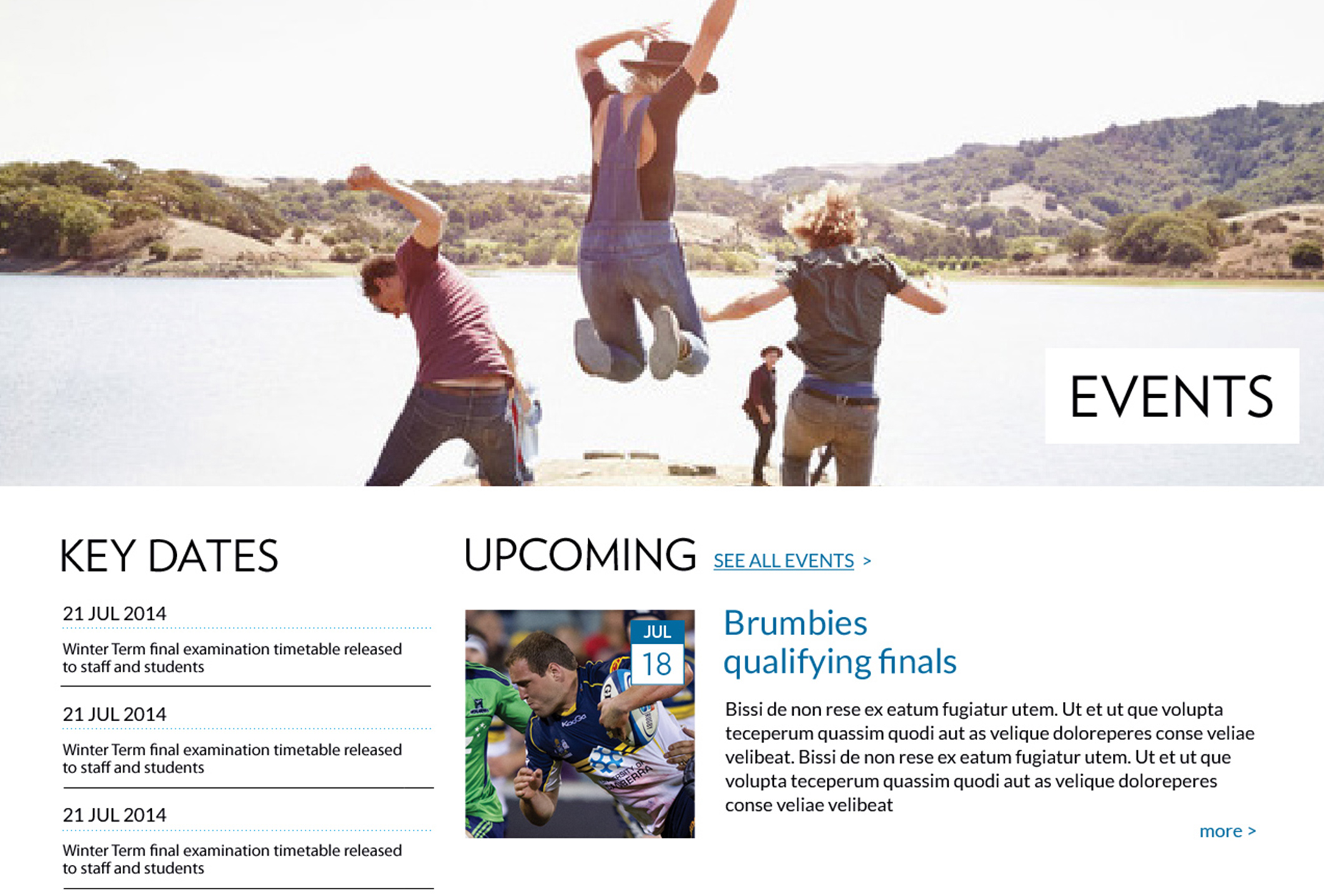
Dynamic content
The home page houses dynamic content, such as news, events and key dates, which changes frequently and needs to be readily available to visitors. The hierarchy of the dynamic content, from feature segments to listed items, allows quick access to the latest and most relevant content.
UI
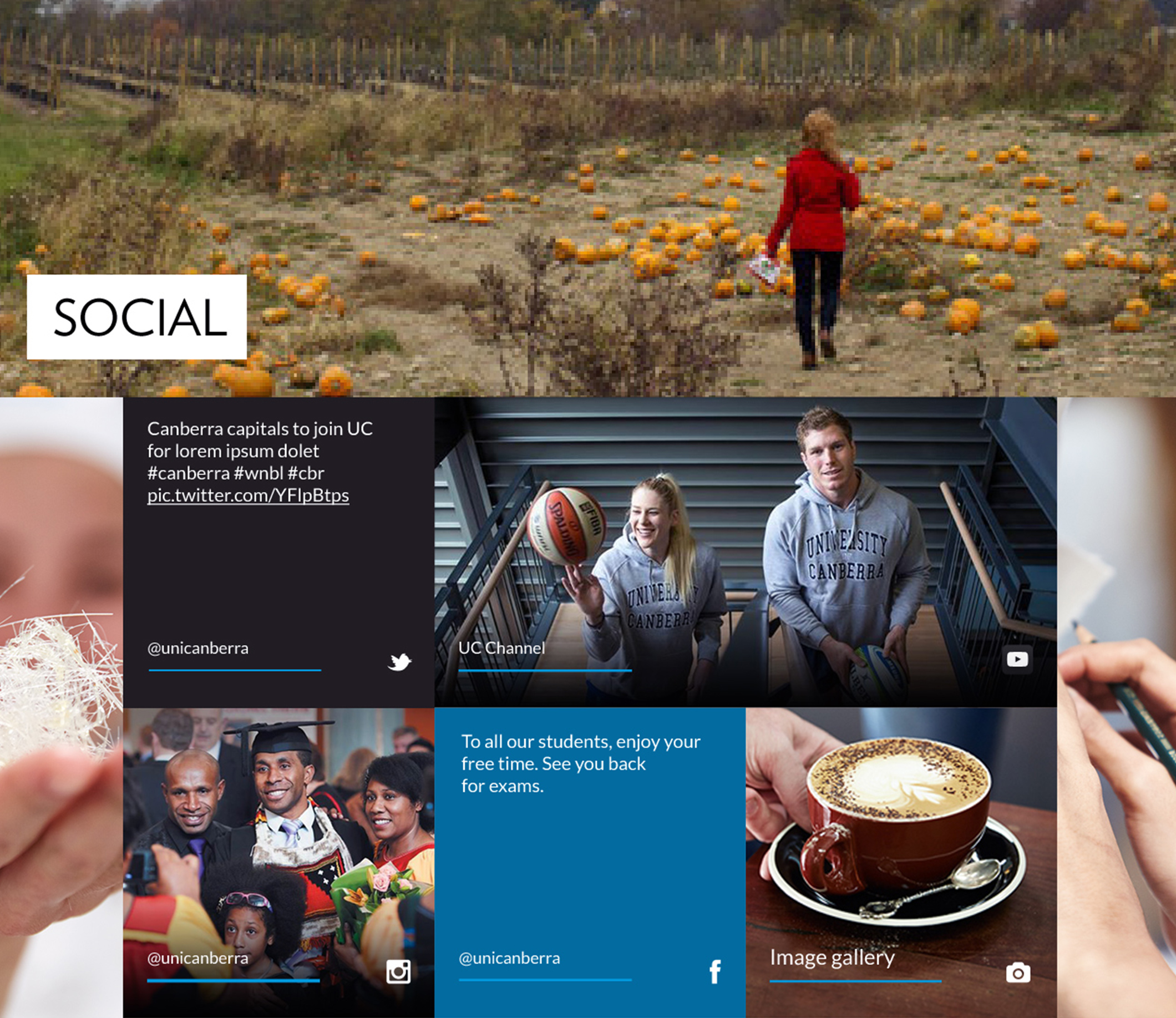
Feed me
The homepage pulls content from all major social media channels, including Facebook, Instagram, Twitter and YouTube. The block-based layout offers a visually striking alternative to a standard listing format and allows for easy display of both image and text-based content.
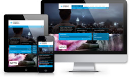
Responsive Design
Mobile first
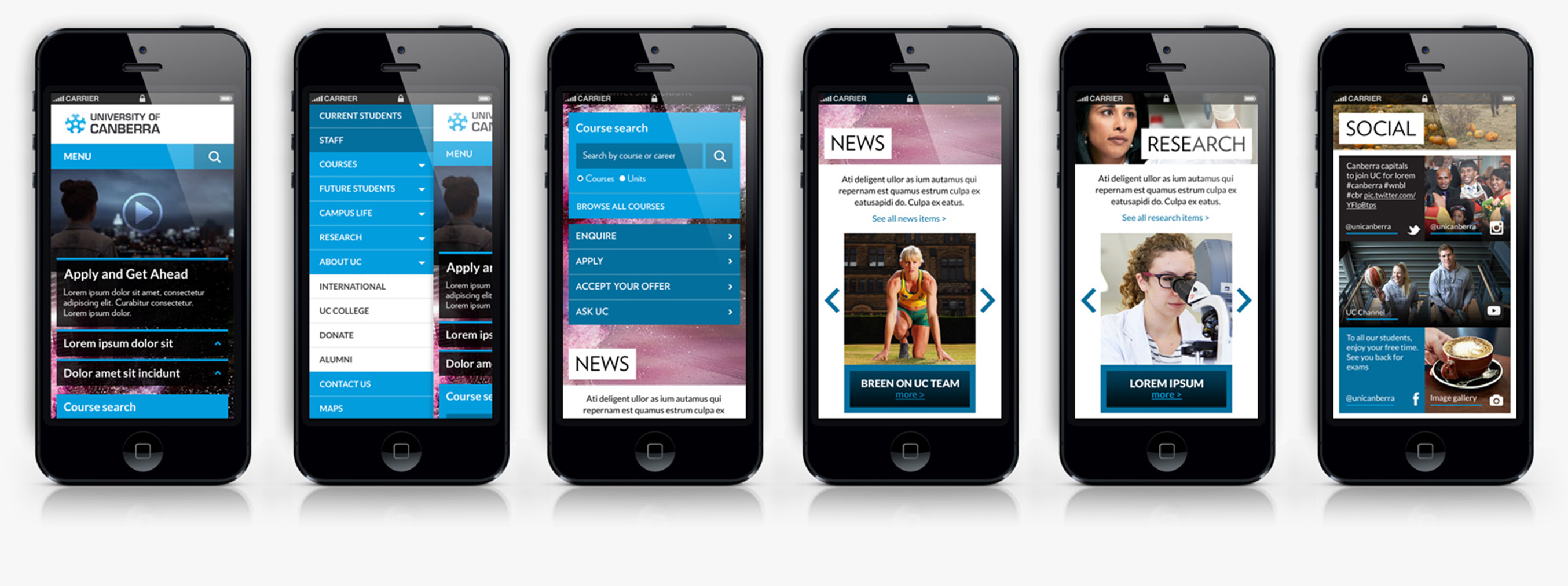
In creating a responsive website, we had to accommodate the varied backgrounds and environments of our target audience. Visitors would expect easy access to up-to-date information, irrespective of their age, location, level of technical skill or access to Wi-Fi. Our primary aim was to make the user journey through the website as intuitive as possible, from the smallest to the biggest devices. To this end, we reduced the amount of general content displayed up front such as news, and used a simple drawer menu to lead users through a complex site structure. We used the Bootstrap grid system to organise content into modular segments, which allowed sections such as the flat-colour block-based social feed section to stack on even the smallest screen. The result was a responsive website which fluidly transitioned from mobile to desktop, retaining ease of access to information and staying true to the print-based look and feel .
FULL SITE DESIGN - HOMEPAGE